


React Custom Hooks is one of the best feature added in React. It allows us to create reusable state logic for components. In this blog I will try to create a form with custom hooks. Also we will see how to create form fields and it states dynamically. We will also see some of the example of Styled Components to make our UI cool.
PermalinkLet's Start
Let's start by creating our react application.
- run
npx create-react-app custom-hooks - run
npm i styled-componentsto install styled-components directory
We are all good to start.
PermalinkCreate our User.js file, it will hold our schema for our form.
- Create a file named User.model.js in
./srcThe file will look like this,
export const User = {
    email : {
        title : "Email",
        placeholder: "Enter your email",
        type : 'email',
        required : true,
        setFunction : 'email',
    },

    username : {
        title : "Username",
        placeholder: "Enter your email",
        type : 'text',
        required : true,
        setFunction : 'username',
    },

    password : {
        title : "Password",
        placeholder: "Enter your password",
        type : 'password',
        required : true,
        setFunction : 'password',
    },

    confirmPassword : {
        title : "Confirm Password",
        placeholder: "Confirm your password",
        type : 'password',
        required : true,
        setFunction : 'confirmPassword',
    },

    address : {
        title : "Address",
        placeholder: "Enter your address",
        type : 'text',
        required : true,
        setFunction : 'address',
    },

    avatar : {
        title : "Choose your avatar",
        placeholder: "Enter your address",
        type : 'file',
        required : false,
        setFunction : 'avatar',
    },
}
Every field has 5 properties based on which we will create our custom form components.
PermalinkLet's create our styled components
We will create some styled components as below,
- Form Control
- Button
- Input
- Modal
- Card
Create a folder Components in ./src. We will create all our components inside this.
PermalinkFormControl
Create a folder named FormControl inside .src/component and then create a JS file with the same name. The path will look like this ./src/component/FormControl/FormControl.js. The Form Component will look like this. FormControl.js
import styled from "styled-components";

export const FormControls = styled.div`
    display: flex;
    flex-direction: column;
    padding: 0 0.4rem;
    text-align:left;
`

export const FormControlTitle = styled.label`
    font-size: 1rem;
    margin:0.4rem 0

`

export const FormControlsValidationMessage = styled.label`
    color: red;
    margin: 0.4rem 0;

`
PermalinkInputs
Inside FormControl folder we will create another file for our input component. The path will look like this
./src/component/FormControl/Input.js.
Input.js
import styled from "styled-components";

export const PrimaryInput = styled.input`
    border:2px solid #04AA6D;
    padding: 0.4rem;
    box-shadow: box-shadow: 0 4px 6px -1px rgb(0 0 0 / 0.1), 0 2px 4px -2px rgb(0 0 0 / 0.1);
    border-radius: 0.2rem;
    &:focus{
        outline : none;
    }
`
PermalinkButtons
Create a folder named Buttons inside .src/component
and then create a JS file with the same name. The path will look like this ./src/component/Buttons/Buttons.js.
The Button Component will look like this.
Buttons.js
import styled from "styled-components"

export const PrimaryButton = styled.button`
background-color: #04AA6D;
border :2px solid #04AA6D;
color: #ffffff;
padding: 0.5rem;
border-radius: 0.2rem;
margin: 0.2rem;
cursor: pointer;
&:hover{
    box-shadow: none;
    background-color: #059862 !important;
}
`

export const SecondaryButton = styled.button`
border :2px solid #04AA6D;
background: none;
color: black;
padding: 0.5rem;
border-radius: 0.2rem;
margin: 0.2rem;
cursor: pointer;
&:hover{
    box-shadow: none;
    background-color: #059862 !important;
    color : white;
}
`
PermalinkCard
In the component folder, following the same structure ./src/component/Card/Card.js. we will create the card component.
Card.js
import styled from "styled-components";

const size = {
    mobileS: '320px',
    mobileM: '375px',
    mobileL: '425px',
    tablet: '768px',
    laptop: '1024px',
    laptopL: '1440px',
    desktop: '2560px'
  }

  export const device = {
    mobileS: `(min-width: ${size.mobileS})`,
    mobileM: `(min-width: ${size.mobileM})`,
    mobileL: `(min-width: ${size.mobileL})`,
    tablet: `(min-width: ${size.tablet})`,
    laptop: `(min-width: ${size.laptop})`,
    laptopL: `(min-width: ${size.laptopL})`,
    desktop: `(min-width: ${size.desktop})`,
    desktopL: `(min-width: ${size.desktop})`
  };
export const Cards = styled.div`
    padding: 0.4rem;
    background: white;
    box-shadow: 0 1px 3px 0 rgb(0 0 0 / 0.1), 0 1px 2px -1px rgb(0 0 0 / 0.1);
    border-radius : 0.2rem;

    @media ${device.mobileS} {
        margin: 0 1.5rem;
    }
    @media ${device.tablet} {
        width: 24rem;
        margin: auto;
    }

`

export const Title = styled.label`
    font-size: 1.4rem;
    font-weight: 500;
    padding : 0.5rem;
`
PermalinkModal
In the component folder, following the same structure ./src/component/Modal/Modal.js. we will create the card component.
Modal.js
import styled from "styled-components";

export const Modal = styled.div`
justify-content: center;
align-items: center;
display : ${({isShow}) => isShow === true ? 'flex' : 'none'}
`

export const ModalOverlay = styled.div`

    background : black;
    position : absolute;
    opacity: 0.5;
    top: 0;
    width : 100vw;
    height: 100vh;
`

export const ModalBody = styled.div`
    width : 50vw;
    height: 30vh;
    background : white;
    position: absolute;
    top: 0;
`
We have our all the components ready. Now lets create our custom hook. Our custom hook will be responsible for all the state for our inputs in our fields. In the ./src create a folder with hooks and inside it create a file with the name of FormHooks.js.
FormHooks.js
import { useState } from "react";


const FormHooks = (initialState) => {
    const [formField, setValue ] = useState(initialState)

    return [
        formField,

        function (key,value) {
            debugger;
            setValue({
                ...formField,
                [key] : {
                    ...formField[key],
                    value,
                    isValid : true
                }
            });
            console.log(formField)
        }
    ]
}

export default FormHooks
Let's understand the code for our hooks. It holds the state of our entire form and return a object and a handler to interact with the state. We have to pass initialstate as an object. Let's see the App Component to understand it better.
PermalinkThe App Component
import {PrimaryButton, SecondaryButton} from './components/Button/Button'
import { useState } from 'react';
import './App.css';

import FormHooks from './components/hooks/FormHooks'
import { PrimaryInput } from './components/FormControls/Input.styles';
import { Cards, Title } from './components/Card/Card';
import {FormControls , FormControlTitle , FormControlsValidationMessage} from './components/FormControls/FormControl'
import {User} from './User.model'
import { Modal, ModalBody, ModalOverlay } from './components/Modals/Modal';
import { Container } from './components/Container/Container';
function App() {
  const [showModal , setModal] = useState(false)
  let initialFormState = {}
  Object.keys(User).forEach(item => {
    initialFormState[User[item].setFunction] = {isValid : false , value : ''}
  });

  const [formField , handleFieldChange] = FormHooks(initialFormState)

  const toggleModal = () => {
      (showModal) ? setModal(false) : setModal(true)
  }
  return (
    <div className="App" style={{'position' : 'relative'}}>
        <Cards>
            {
              Object.keys(User).map(item => {
                 let field = User[item]
                 return(
                  <FormControls>
                      <FormControlTitle>{field.title}</FormControlTitle>
                      <PrimaryInput value={formField[field.setFunction].value} onChange={(e) => {handleFieldChange(field.setFunction,e.target.value)}} placeholder={field.placeholder} type={field.type} />
                      {!formField[field.setFunction].isValid && <FormControlsValidationMessage>This is error</FormControlsValidationMessage>}
                  </FormControls>
                  )
              })

            }
            <PrimaryButton onClick = {toggleModal}>Show Details</PrimaryButton>
            <SecondaryButton>Cancel</SecondaryButton>
        </Cards>


        <Modal isShow = {showModal}>
            <ModalOverlay/>
            <ModalBody>
             <ShowDetails formDetails = {formField}/>
             <SecondaryButton onClick={toggleModal}>Cancel</SecondaryButton>
            </ModalBody>
        </Modal>

    </div>
  );
}
If we closely look at the app component,
let initialFormState = {}
  Object.keys(User).forEach(item => {
    initialFormState[User[item].setFunction] = {isValid : false , value : ''}
  });
We are initiating our form Object dynamically from the User schema. If any fields are added or removed in the user schema it will automatically update the form state. It is very easy and reusable rather than specifying each field and a state with it.
Next we will initialize our custom hooks and pass the above object as initial state.
const [formField , handleFieldChange] = FormHooks(initialFormState)
We can use the formField object to access all the fields for our form, and also reuse this form object to any other components.
Object.keys(User).map(item => {
                 let field = User[item]
                 return(
                  <FormControls>
                      <FormControlTitle>{field.title}</FormControlTitle>
                      <PrimaryInput value={formField[field.setFunction].value} onChange={(e) => {handleFieldChange(field.setFunction,e.target.value)}} placeholder={field.placeholder} type={field.type} />
                      {!formField[field.setFunction].isValid && <FormControlsValidationMessage>This is error</FormControlsValidationMessage>}
                  </FormControls>
The above code iterates over all the field in User Schema and creates a controlled component for each field. If we change the value in any of the input field it will automatically change the formObject.
Next we will pass this formObject as a props to our ShowDetails component to show all the value.
<Modal isShow = {showModal}>
            <ModalOverlay/>
            <ModalBody>
             <ShowDetails formDetails = {formField}/>
             <SecondaryButton onClick={toggleModal}>Cancel</SecondaryButton>
            </ModalBody>
        </Modal>
Show Details Component
const ShowDetails = ({formDetails}) => {
    return(
      <div>
        {
          Object.keys(formDetails).map((item) => {
            return(

              <Container>
                  <div style={{'fontWeight' : '500' , 'margin' : '0 10px'}}>{item}:</div>

                  <div>{formDetails[item].value}</div>
              </Container>
            )
          })
        }
      </div>
    )
}
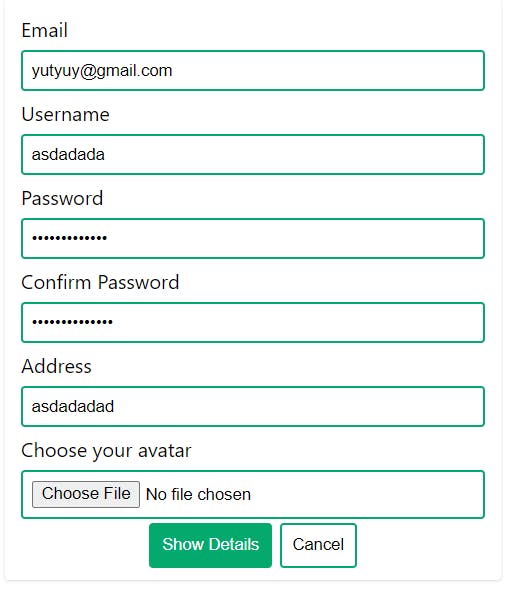
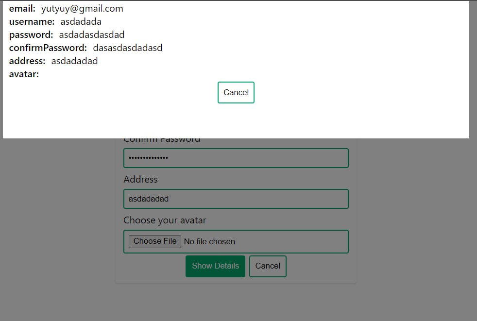
This is it, and the last result is amazing. We have created only one custom hooks to manage the state of an entire form controls and reused the hook in multiple components. Here is the result.
Form Component
Show Details Component
PermalinkConclusion
React Custom Hooks are very handy when it comes to reuse logics. We can have more complex custom hooks with all the in-build react hooks. That's it for today. : )